Connected TV is in one of its most exciting phases of growth, with more content choice than ever at our fingertips. It is apparent that televisions are still staples within homes, and with Smart TVs and set-top boxes like Roku and Apple TV changing the face of television as we know it, users have never had so much choice of OTT content. This is why the User Experience (UX) and User Interface (UI) is of paramount importance when trying to attract users to your TV application.
It is key to note that designing for Connected TV requires a unique set of considerations in comparison to designing for web and mobile as it is still a relatively new area, and the following blog will delve deeper into the fundamentals of designing for TV that you should consider.
Remote control interactions
With TV, the user is generally limited with their actions on a remote control, with the primary navigation being through the directional pad (D-pad). This pad limits movement to up, down, left, and right with a select button that selects an item focused on-screen.
When designing your Connected TV app, it is extremely important to test constantly with the remote control to ensure the app is easy to navigate for the user as the D-pad is often less intuitive than a touch screen.
It is useful to note that D-pads, touch remotes, gestures, or voice-enabled TV remotes can take the place of pointing and clicking or tapping.
The two main questions to consider when testing are:
Can users easily navigate to all objects on each screen?
 Can users easily navigate to all objects on each screen?
Is movement between objects straightforward and predictable?
Some platforms – like Amazon Fire TV – are experimenting with voice input allowing users to control their CTV experience with their voice. Others, for example, like the new Apple TV, also use touch input, and these innovations are allowing for easier navigation for users.
White space
Before we delve into white space and the benefits of utilising this, it’s first important to touch on what exactly white space is. White space is defined as “an unoccupied piece of real estate with zero text or graphics layered on top.”
White space is an incredibly important part to consider in the design process as it is key that you avoid overloading users with content. If too much content is presented to the user at one time, they often face something called ‘decision paralysis’, meaning that the user is overwhelmed and has a complete lack of ability to decide. By applying white space when designing for TV, you are providing visual breathing room for a user’s eyes to help them decide on the content they wish to consume.
The interface must provide users with a balance between both content and space as it helps them through the decision-making process, which in turn can increase content legibility and interactions. This is achieved by reducing the number of distractions preventing a user from making a decision.
According to research conducted by Human Factors International, white space increases user comprehension by almost 20%.
“White space creates clear separations that focus a user’s eyes on the content you want them to look at.”
Including white space within the design of your app is a crucial part of the design process. It’s modern, sleek, visually stimulating, and proven to help users decide what content to watch.
Good examples of white space
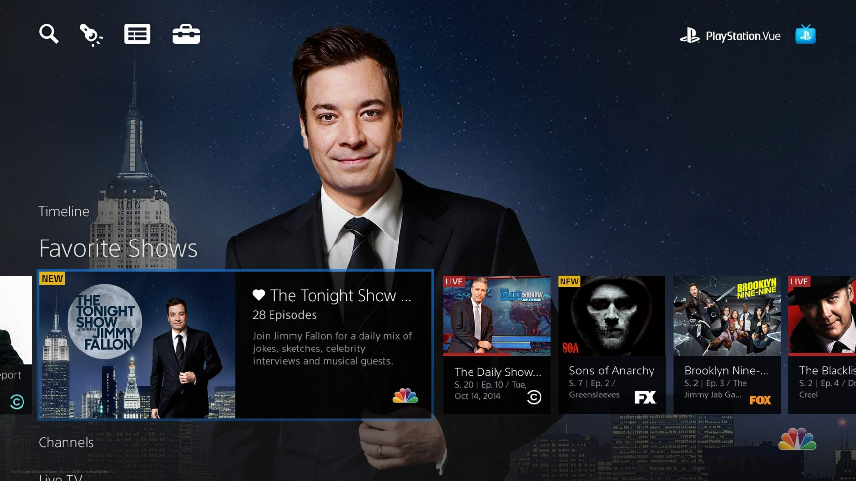
Good balance and hierarchy between elements (Photo credit: Toptal)
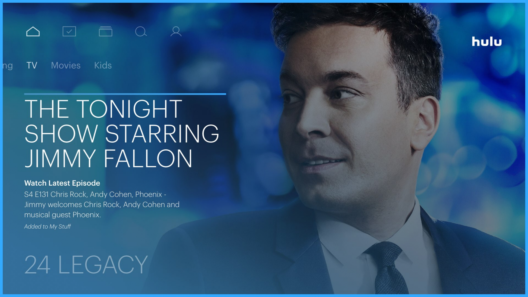
Hulu use white space effectively within their app (Photo credit: Toptal)
Design a groundbreaking Connected TV app for your audience.Contact us nowTV Screens
The TV experience occurs across varying amounts of space and must be legible from ten feet away, and this is often referred to as the 10-foot experience. This is because the typical user views the screen from ten feet away, or sometimes more. Although the screen itself can be large, the perceived screen resolution is lower, and distance from the screen results in a smaller angle of view.
Within the design phase, a clean, simple design is required as it allows users to process information much easier, so ensure that the number of design elements or UI components are limited and ensure that the important elements (menus, buttons, images) are large enough and far apart enough to clearly read from a distance. As users don’t read much text on TV screens, be mindful of the amount of text you include.
When testing the TV app, ensure you are keeping ten feet of distance to check the legibility of the UI.
Safe Areas
TVs have what’s called an ‘overscan’ which is where part of the input picture is shown outside of the visible bounds of the screen.
To avoid overscan when designing, it is important to note that content should not reach the edge of the screen. Any content that is placed at the edge of a screen could be inaccessible to users with smaller TVs. It is important to avoid any critical information being shown too close to the edge of the screen to avoid it being clipped.
A typical bleed for TV application design would be 60px top and bottom, and 90px left and right.
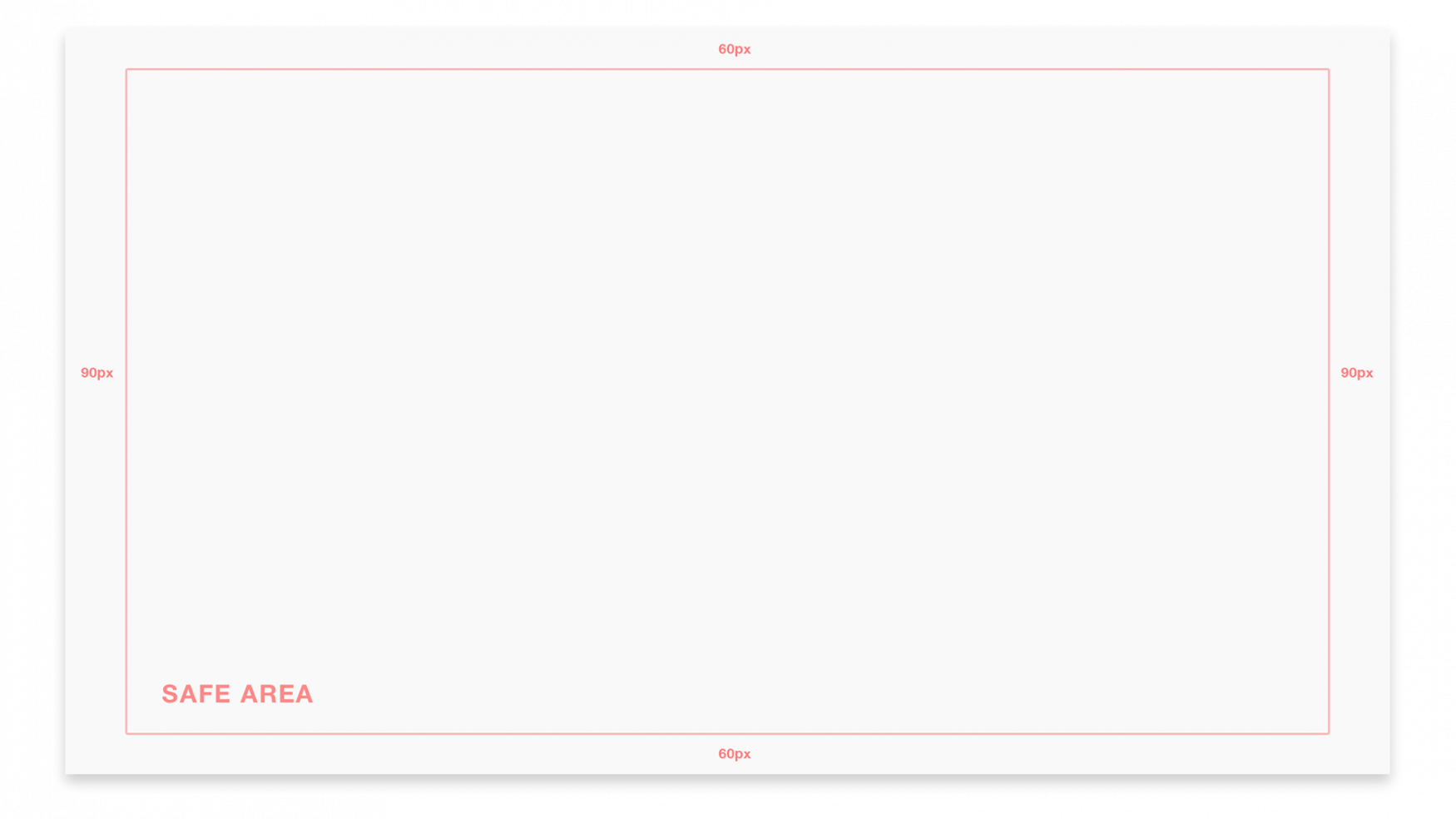
Google and Amazon Fire TV guidelines suggest you keep the 5% margin into your TV screen designs to account for the overscan area. On a 1920 x 1080 screen, this margin should be a minimum of 27 pixels from the top and bottom edges and a minimum of 48 pixels from the right and left edges of the picture.
Apple tvOS suggests keeping an area spanning 60 pixels from the top and bottom of the screen, and 90 pixels from the sides.
Ambience
Another important factor to consider when designing for TV is the ambience and lighting, as different ambient lighting conditions can impact viewing alongside TV placement causing issues with glare depending on certain times of the day.
Both contrast and legibility are key factors to a TV UI. Whilst designing, it is key to always test the legibility of the fonts and colour contrast.
When testing in ambient lighting conditions, you should consider something called ‘Scan Lines’. It is useful to note that the image on a television screen is composed of odd and even scan lines. The television renders these lines in phases alternating rapidly between odd and even scan lines. Any single pixel (or line of pixels) falling onto a single scan line will flicker. In order to avoid flickering of your items on the screen, you should always keep your lines to even numbers and no thinner than 2 pixels.
To overcome the issue of glare and natural light reflecting on the TV screen when testing, try changing the position of the TV during different times of the day as well as opening and closing blinds to either allow or block sunlight into the room whilst testing. By doing this, you can then validate the contrast and legibility of your design according to the sunlight exposure.
When testing with different lighting conditions, the general rule is to avoid sharp edges between highly contrasting colours (especially bright colours next to dark colours) and to avoid “hot” colours such as very saturated reds and yellows. These will bleed more easily than less saturated colours or cooler colours such as blues and greens. These can be very difficult to read with glare and reflections on the screen. If possible, preview your app on multiple TVs because colours can vary dramatically between television models. Simply attach the HDMI cable from your TV set and test it out.
Accessibility
In recent years, TV has become more accessible than ever, and with improvements in TV hardware and software constantly evolving, the industry is making great strides to ensure content is accessible to everyone.
It’s key to note that user interfaces (UIs) should be less dense and design elements should be larger so they can be read from across a room. Relate this to the “10-foot experiences” previously mentioned. Thin, small text on your monitor display will no doubt look clean and crisp on your monitor display, but once tested on a TV, it could become unreadable, so the key to good typography on TV is to test constantly. If in doubt, increase both the size and weight of the font.
For users that are partially sighted, it’s worth considering including options within your app to increase the text size on the screen, change font styles, change colour contrasts and magnify the screen.
For those users with total sight loss, an in-built screen reader will speak out everything text-based, such as programme guides and menus.
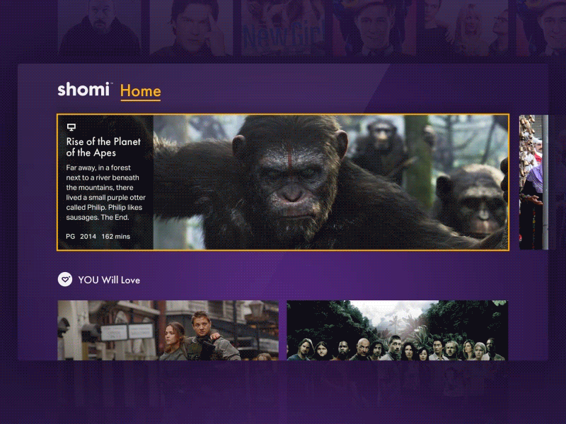
The other critical element in TV UIs to help with accessibility is the ‘Focus State’. Without the ability to touch the screen or use a mouse, users must navigate to the element they want to select. As the user navigates within the app, different UI elements should be highlighted indicating that a navigation element is in focus. This helps users to recognise their current on-screen location and eases navigation, helping the users to understand where they currently are and where they can move to next.
In turn, each of these elements combined can help with the consumption of your app’s content and increase the size of your audience base by making it accessible to all.
Yellow highlight indicating that the navigation element is in focus (Photo credit: Toptal)
Conclusion: Make your TV App stand out
With more TV content at our disposal than ever before, there has never been a more exciting time to break into the TV space. Smart TVs are quickly becoming flooded with applications from content providers of all shapes and sizes as the opportunities presented from building a TV app are extremely promising.
When designing a TV app, the fundamentals to consider that we have covered can allow you to maximise the engagement with your audience and build an experience that trumps your competitors, as this is a market that is growing at an extremely rapid rate, and the ability to stand out through your app is vital.