When users sign up to an OTT product via their TV, there are a few important things to consider. What platform is the app launching on? What details need to be captured? What are the platform guidelines? What commercial agreements are in place? What native features are available to users? What region is the application being launched in? All of these elements need to be taken into consideration when creating a seamless sign up and log in flow for a Connected TV application.
In this article, I will examine these factors in greater detail, providing the crucial steps required to create a seamless user experience for your Connected TV offering.
Sign up
The majority of platforms have some flexibility on how users can sign up. For the most part, users will often be able to sign up to a TV app via the web using device linking. This will typically require custom URL’s to be created based on the device a user is signing up from. For example, if a user is signing up via a Samsung TV, the URL that displays on their TV would look something like: ‘brandname.com/samsung’. This allows the brand to track which device the user signed up from and attribute associated commission to the relevant platform.
Other platforms can be more strict around this process. Roku, for example, will not allow users to sign up via the web. Instead, they are required to sign up on the TV and have to input their details using the remote control and TV keyboard. This is due to the commercial agreements they have in place with brands.
Forms
When giving users the option to sign up via TV, it’s best practice to reduce the amount of details required to be captured. Ideally, this should only be email and password, however, this is not always feasible due to legal/marketing purposes.
Even though signing up via TV and the remote is not the smoothest of experiences, there are ways to improve this which are highlighted below.
Pulling through saved details
A great feature of Apple TV is the ability to pull through a previously used email address associated with the Apple ID into the email sign up field; a relatively straightforward feature that reduces friction and speeds up the sign in/up process.
Remove the need for validation
This is a contentious issue. Often when you sign up for subscriptions/services via the web, the form will include a level of validation such as re-entering your email address and or password.
Now, this can be done on TV, however, the pain of re-entering complex passwords can cause a negative experience in the user journey and potentially impact conversation rates. That’s not to say we can’t include some sort of validation, for example, making sure all fields are filled, email addresses include an ‘@’ symbol, and passwords meet a certain strength criteria.
It’s a balancing act of making sure the data collected is 100% accurate and that friction is reduced for the user.
Create a stunning Connected TV application.Contact us nowSigning in
Device linking/QR codes
As mentioned above, typically when signing into a TV app, we have come to expect the device linking screen, directing users to a webpage where they can enter their account credentials and the code presented on the TV to authenticate the user and sign them in.
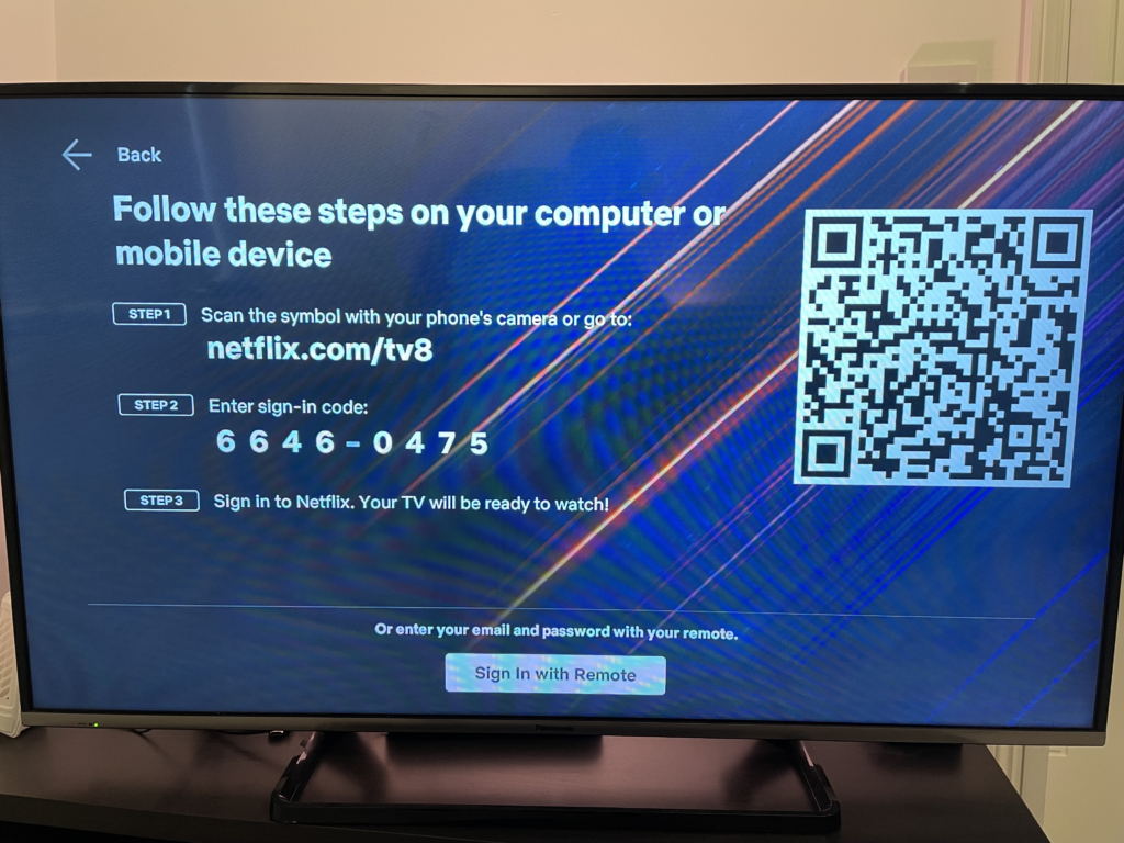
Where possible, it’s best practice to sign into a TV application via another method instead of using the TV remote and TV keyboard due to the clunky nature of inputting text with a TV remote. This can be even more frustrating if the user forgets their password and has to reset it.
To make the device linking journey even smoother, you can often see QR codes being used on device linking screens to navigate users to the webpage to save them typing it on their mobile device.
However, some platforms can reject TV apps that include this feature, for example, Amazon has been known to stop a TV application from passing submission for including QR codes on the webpage. It’s always best to check with each platform on their app submission criteria, especially around signing up and logging in.
Personalisation
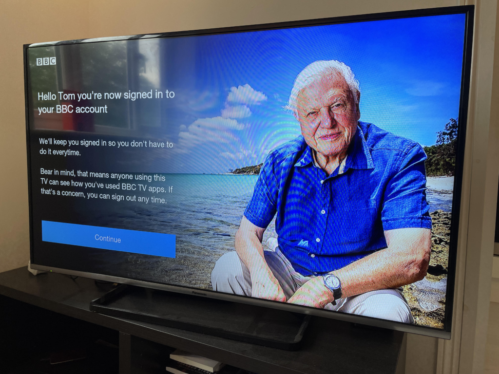
Where possible, it’s always good practice to include personalisation, especially during the sign up/onboarding process. For example, when a user signs in via device linking, typically the TV app would display a success page to inform the user they have now signed in. Here is a great opportunity to mention the customer’s name, for example, “Hello Tom, you’re now signed in on your TV”
Keeping users logged in
Unlike other devices, a TV is far more secure compared to a mobile or laptop as the device never leaves the home. Therefore, it’s recommended to keep user sessions stored so they are always logged into the TV app, meaning they only ever have to sign in once, unless they don’t access the app for significant period of time or they sign in to a different WiFi.
Keyboard entry
Netflix has set the standard for the custom TV keyboard to shorten the input of text and this is particularly relevant for search. However, when it comes down to the sign up/login process, the keyboard will require all of the special characters and symbols to be available.
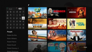
When deciding over whether to develop a custom keyboard for your TV application, it’s important to weigh up the pros and cons. If you’re rolling out into multiple territories and using different languages, then there’s additional work to consider in creating keyboards for the various required alphabets. However, the beauty of a custom keyboard is that it gives brands full control over the styling, positioning and user experience. For example, including useful shortcuts or predictive text such as ‘.com‘ buttons to speed up the entry of data.
Native keyboards do come with the ability to handle multiple languages out of the box, and some of them even allow for an element of custom placement of the keyboard positioning such as the PS4‘s keyboard. Others are unalterable, such as Amazon Fire‘s native keyboard which is placed slap bang in the middle of the application with a dark overlay, making it tricky if you want users to see the input fields.
Leveraging native features
There are also several additional native features dedicated to certain platforms that can significantly improve the UX process.
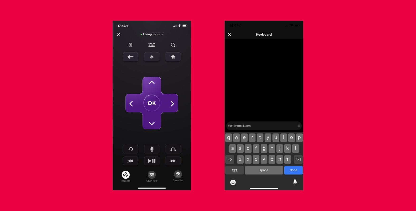
Roku’s mobile keyboard
Roku has its very own native mobile application that acts as the physical Roku remote control. As well as allowing users to navigate Roku’s interface and applications, developers can also leverage the in-app keyboard to allow for quicker entry of text information, such as the login screen.
Apple TV & signing in via the mobile app
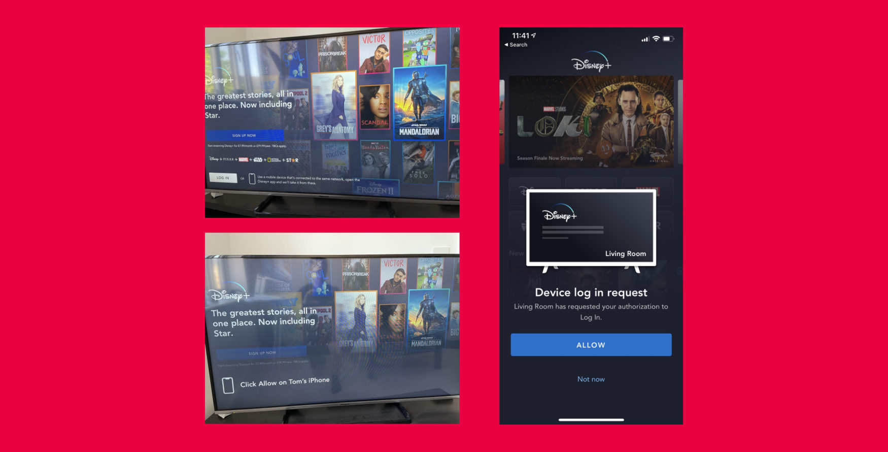
If a user is already signed in on a mobile app and connected to the same WiFi, they can sign into the TV app automatically by opening the mobile application.
Conclusion
What’s most exciting about working in Connected TV is the continuous progression in improving the user experience. Whether it’s leveraging a second screen experience or a device’s native features, Connected TV is rapidly evolving to provide the most seamless sign in journey possible.
As the market grows more and more competitive, it’s no surprise to see apps investing in better UX to ensure they retain viewers or subscribers. With new devices and Smart TVs continuously being released, and with more and more content providers entering the streaming market, there’s a push for innovation in this space which ultimately benefits the user, and that’s certainly not a bad thing.


